Thoughts on web technology and building web pages (2010)
Today I was talking about Google with my cousin.
I remember that six or seven years ago Yahoo was still the mainstream… but in the blink of an eye,
Google’s monthly searches have passed “3.1 billion”.
On top of that there are other very powerful proprietary tools:
Google Maps
Google Calendar
Google Translate
…
And now it has even built its own Nexus One to take on the iPhone.
It’s striking how fast web technology has moved in just ten years,
a living example of globalisation.
Web production notes (1)
When it comes to designing web pages, I’m not an expert,
but I do know a little about HTML5 vs Flash, Firefox vs IE and so on.
Back to the topic: today I want to introduce two ways of building a “static” web page layout:
1) Export the page straight from Photoshop, then edit it directly in Dreamweaver.
2) Make the page elements in Photoshop piece by piece, then edit the source in Dreamweaver (you need to know how div and CSS work).
After building quite a few sites, I find most people now lean towards using <div> and CSS for page layout!
1) The Photoshop slice tool
Building web pages always involves drawing. Once the design is finished in Photoshop, the slice tool cuts it into buttons, text frames and so on according to the regions you define. Convert it to an HTML file, import it into Dreamweaver, and you can edit it.
Example: the Nintendo Game Boy Advance game pages were laid out exactly this way.
A page converted from Photoshop is easy to spot: open its source and you’ll soon find traces of “spacer.gif”.
Reference: PSD to HTML Slicing Tutorials (Internet Archive copy)
2) <div> and CSS
The other method is to use div. A div is an HTML tag that wraps any object on the page (text, images…); think of it as Photoshop’s Group feature.
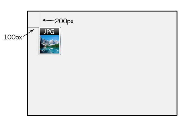
The most powerful part: with a div you can place your object anywhere, without being limited by traditional HTML td and tr table cells. For example:
<div style="position:absolute; top:200px; left:100px;"><img src="images/pic.jpg" /></div>In this div I fixed the image to the top-left, a little way in from the edge of the page. If you think of it as coordinates, left is the x-coordinate, top is the y-coordinate, and the image is placed starting at (100, 200).
So what is CSS? It is a very convenient style sheet that changes text, formatting, colours and more. You give a style a name and then define its properties. Using the example above, this time change the source to:
<div id="mystyle"><img src="images/pic.jpg" /></div>and add the following to the CSS file or the page:
#mystyle {
    position: absolute;
    top: 200px;
    left: 100px;
}
Sharp-eyed readers will see that this thing called “mystyle” contains exactly the same thing as the earlier style="…", and that is what CSS is! But why do it this way? Because a style written once can be reused by many elements, and a later change only has to be made in one place.
Archive note (2026): these 2010 notes are kept as written, apart from repaired formatting, a dead link and code that had been stripped out. Nobody lays out whole pages with absolute positioning any more; Flexbox and CSS Grid replaced tables and spacer.gif. The underlying principle, keeping content and presentation separate, still holds.